ThemeWare® Features
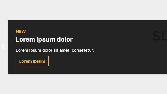
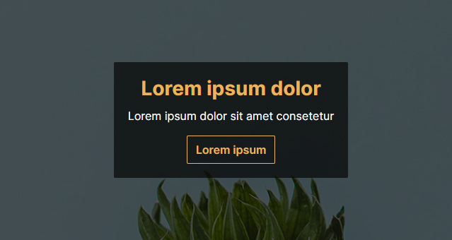
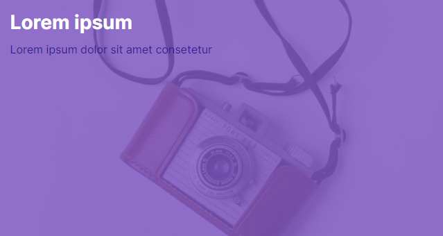
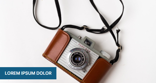
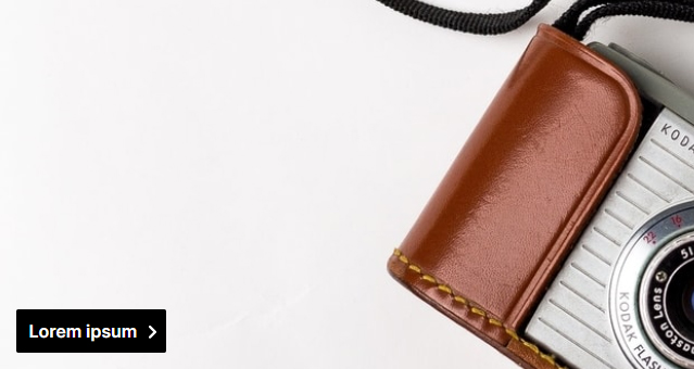
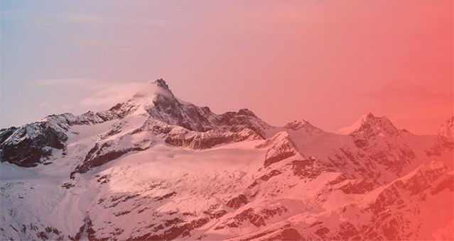
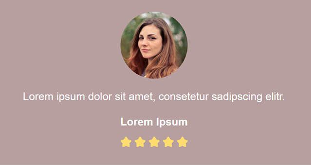
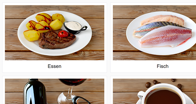
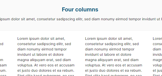
In addition to the obvious features such as the USP bar in the header and footer, ThemeWare® provides you with many other features such as various CSS classes, extensions, CMS blocks and CMS elements with which you can customise your shop and your Shopping Experience and optimise it to boost sales.
You can find many helpful articles and instructions on this in our ThemeWare® Knowledge Base. In addition, you will find many examples below which we - like our documentation itself - are constantly expanding.
More elements will follow... Be curious!
More elements will follow... Be curious!
More elements will follow... Be curious!
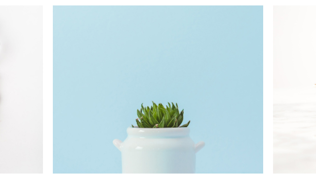
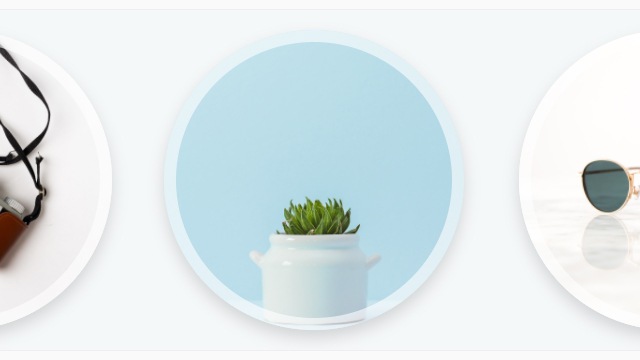
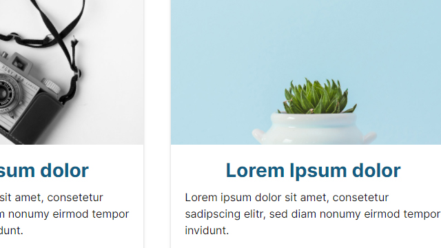
Note: Our CMS demos are based on the same Shopping Experience layout for all themes. Depending on the theme configuration, one or the other CMS element may therefore not be displayed perfectly in a certain scenario. However, the display can certainly be optimised via individual CSS classes.
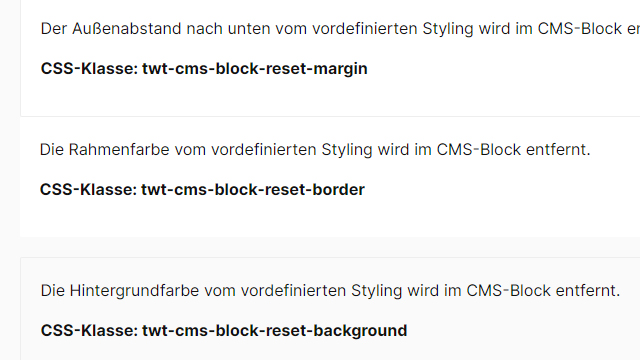
Border colours: In the Clean theme, for example, the border colour of the "ThemeWare® CMS Styling" is configured to "white" which is why the CMS blocks have no visible border despite the "ThemeWare® CMS Styling".
Border radius: The border radius of CMS blocks or images depends on the theme configuration. If the border-radius is configured to "0px" in a theme, there will be no rounded corners in the demos.
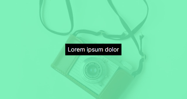
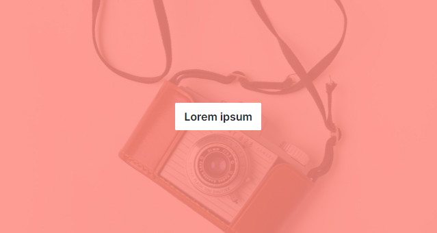
Text colours: In some themes the primary colour may be light, in others very dark. With dark colours, text in one or the other CMS block may not be legible due to a black text colour. The CSS class "text-white" can help here, for example.
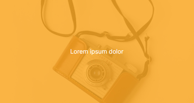
Background colour: Depending on the theme, the primary or secondary colour may be configured similarly or identically to the general text colour of the CMS block. In this case, the text is not readable or only with difficulty. If necessary, use the CSS classes "text-white" or "text-dark".